Brand Refresh, Not Rebrand: How Duolingo, Fenty & Discord Updated Without Starting From Scratch
- Dec 16, 2025
- 6 min read
A lot of brands assume that if things feel “off”, the whole idea must be wrong.
But often, the problem isn’t the business itself — it’s how the brand is being seen:
The visuals feel dated or generic
The messaging is vague, so people don’t really “get it”
The content and campaigns don’t match how the audience actually lives and scrolls
In other words: the brand idea is fine, but the way it’s being communicated hasn’t kept up or not sharp enough.
That’s where a brand refresh comes in: same core, clearer and more current expression.
Here’s how three well-known brands — Duolingo, Fenty Beauty and Discord, refreshed without starting from scratch, and how those shifts helped level up how people see and use them.
What a Brand Refresh Actually Is (and Isn’t)
A brand refresh doesn’t throw everything out.
It usually keeps:
The same core product or service
The same main audience (or a natural extension of it)
The same big idea or promise
And updates:
How the brand looks (visual identity, imagery, campaigns)
How the brand sounds (tone of voice, messaging, content)
Where and how it shows up (channels, formats, touchpoints)
“Same brand at the core, sharper and more relevant on the surface.”
With that in mind, let’s look at what Duolingo, Fenty and Discord actually did.
Duolingo: Same App, Sharper Character
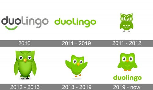
Before the Refresh
Duolingo was already a useful language-learning app with a friendly green owl.
Solid product
Clear concept
Recognisable mascot
But visually and behaviour-wise, it was more “nice utility” than “culture brand”:
Cute but relatively tame visuals
Playful but safe tone of voice
Less distinct personality compared to what it is now
How They Refreshed Their Brand

Refined the visual style of the owl and interface– More expressive character design– Bolder colour use– Cleaner, more confident shapes
Turned the owl into a full character on social– Chaotic TikToks– Jokes about reminders– Trend participation as “the owl”
Dialled the tone of voice up to “unhinged internet friend”– Self-aware, meme-y, very online
Made that personality consistent everywhere– In-app copy– Push notifications– Social content– Campaigns
The app didn’t fundamentally change.The brand expression did.
How the Refresh Helped

Duolingo became instantly recognisable even out of product context — if you see the owl, you know.
The brand moved from “just another education app” to a cultural reference point on social.
The stronger personality made reminders and learning nudges feel less like nagging and more like an ongoing joke — keeping people engaged longer.
Who They’re Talking To Now
Younger, mobile-native learners
People who live in TikTok, meme and internet culture
Users who expect apps to feel like characters, not corporate tools
The refresh works because it speaks in their language. The exact same move would flop if Duolingo’s main users were formal, older learners — but for their audience, it’s dead-on.
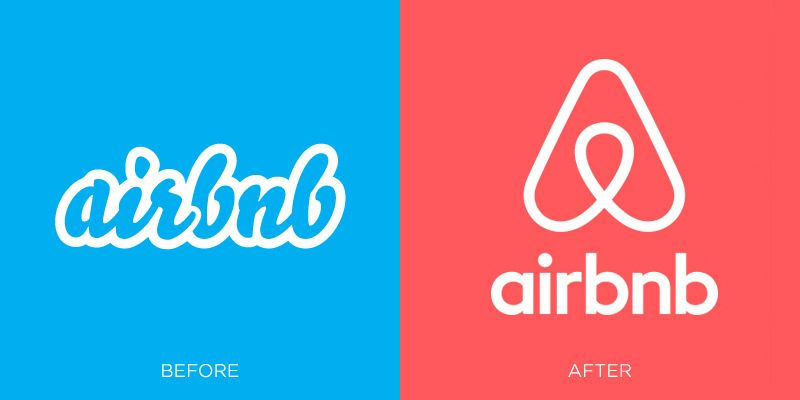
Fenty Beauty: Evolving the Look, Keeping the Promise

Before the Refresh
Fenty entered the market with a very strong idea from day one:shade inclusivity and proper representation.
The product, positioning and Rihanna’s involvement were already powerful.
The early brand world was:
High-glam, punchy campaigns
Distinctive packaging and visuals compared to legacy beauty
Very “launch moment” energy
The idea wasn’t broken; if anything, it was ahead of the industry.What needed to evolve was how that idea kept living over time.
How They Refreshed Their Brand

Imagery evolution
Still inclusive and diverse, but with a more mature mix of editorial and everyday looks
Subtle shifts in lighting, styling and composition to feel richer and more dimensional

Content & campaigns
More social-first content: TikToks, creators, GRWMs, routine content
Less “only big glossy launches”, more ongoing, everyday presence

Brand world expansion
New lines (skin, body, etc.) with tailored visuals that still clearly belong to Fenty

Rihanna as an active creator, not just a face
She appears using the products, talking about them, building looks with them
Messaging often leans into “I use this / I created this” — fame used as proof of taste and involvement, not just borrowed star power
How the Refresh Helped
Kept Fenty feeling current and relevant as platforms and content formats shifted
Strengthened the perception that Fenty is a real, working brand — not a one-time celebrity drop
Deepened trust: Rihanna’s visible use and hands-on role reinforces that the products are genuinely part of her world
Who They’re Talking To
Beauty consumers who care about shade range and representation
Social-media-native shoppers who discover and evaluate products through short-form video and creators
People who put a lot of trust in what real people and founders actually use
The refresh meets that audience where they are now:On their phones, watching how people actually put product on their face — not just in static campaign shots.
Discord: From Gamer Tool to Community Home
Before the Refresh
Discord was already a hit in gaming:a free, low-latency voice and text app for gamers and friends.
The core mechanics worked:
Servers
Channels
Voice chat, screen share, emojis, GIFs
The brand, though, was mostly framed as “for gamers” with a very niche feel.
Again: the idea was working.The refresh wasn’t about fixing a broken product — it was about broadening who could see themselves in it.
How They Refreshed Their Brand
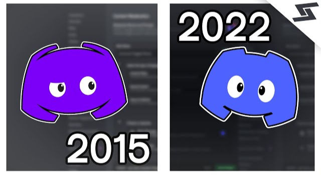
Visual refinement
Cleaned up the logo and mascot so they worked better at all sizes
Updated typography and colour system for a more versatile, polished feel
Still fun, but less “only for hardcore gamers”

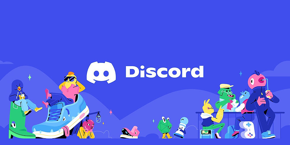
Reframed product examples
Same features (servers, channels, roles, rich media)
New use cases highlighted: study servers, fandoms, creator communities, learning groups, casual friend spaces
Messaging shift
From “where gamers talk”
To “a place for communities to hang out”, with gaming as one important part of that
How the Refresh Helped
Made non-gamers think: “Oh, this might be for me too.”
Let Discord grow from a niche tool into a default home for a lot of online groups
Helped investors, press and mainstream users understand it as a community platform, not “just another gaming app”
The functionality barely changed; the story and surface did.
Who They’re Talking To
With the refresh, Discord effectively speaks to:
Gamers (original core)
Gen Z / younger millennials who live in online group chats and niche communities
Creators, fandoms, study groups and learning communities
Instead of diluting the experience, the refresh clarifies what makes Discord special (servers, channels, rich chat) and shows that to more of the right people.
What Your Brand Can Take from These Refreshes
You don’t need Duolingo’s budget or Fenty’s fame to apply the same thinking.
Here’s what’s consistent across all three:
The core offer stayed the same.The app, the beauty products, the platform — all recognisable.
The audience was understood more deeply.Internet-native learners, beauty shoppers on TikTok, community users beyond gamers.
The brand expression caught up with how people actually live and scroll.More social-first, more character, more everyday relevance.
They didn’t throw out what was working.They amplified it, clarified it, and made it feel more current.
For a lot of beauty, fashion and lifestyle brands, that’s exactly what’s needed:not a total reinvention — a sharp, strategic refresh.
Where a Brand Refresh Fits Into Your World
If your brand:
Still has a solid core idea
Still speaks to largely the same audience
But looks and feels two or three years behind where you actually are
…you’re probably not in “burn it all down” rebrand territory. You’re in refresh territory.
That might look like:
Updating your visual identity without losing recognisability
Evolving your imagery and content style
Tightening your messaging so your audience instantly “gets” you
Aligning your website, socials and campaigns so they finally feel like one brand
Not Sure if You Need a Refresh or Rebrand?
This is exactly where we come in.
At The Stylatude, we work with beauty, fashion and lifestyle brands who know something needs to shift — they’re just not sure how big the shift should be.
We help you:
Decide whether you actually need a refresh or a full rebrand
Redesign your identity, website and campaigns so they match your current level
Build a brand world that feels as clear and intentional as your product
👉 Book a Brand Clarity Call or
👉 Explore our Brand Glow-Up / Rebrand service to see how we approach this for clients.


Comments