Rebrand Examples: Crocs, SKIMS & Diesel (And When You Really Need a Rebrand)
- Dec 21, 2025
- 5 min read
Sometimes a new logo or cleaner visuals are enough. Sometimes… the brand you started with just doesn’t fit anymore.
A rebrand isn’t about being bored of your logo. It’s a strategic shift in who the brand is for, what it stands for, and how it’s understood.
Quick check: How to know if a brand needs a "rebrand".
Has your audience levelled up, but your brand still talks to who you were a few years ago?
Are your prices and product quality higher now, while your brand still looks entry-level or DIY?
Do people keep misunderstanding what you do or putting you in the wrong box, even after seeing your site or socials?
Are you making a big shift (new category, new market, new model) and your current brand just doesn’t stretch that far?
Has your brand picked up baggage or a bad rep (old drama, dated associations, the wrong crowd) that you don’t want to carry into the next phase?
Do you feel like a completely different brand on the inside to what shows up online—even after trying small tweaks?
Below are three strong rebrand examples Crocs, SKIMS and Diesel — and what they reveal about when a brand truly needs to change course.
Crocs: From “Ugly Joke” to Fashion-Adjacent Cult Brand
Before the rebrand (perception problem)

Crocs launched as practical foam clogs: comfortable, waterproof… and widely mocked.
For years, the brand was associated with:
“Ugly but comfy”
Functional professions (chefs, nurses, gardeners)
Internet jokes before meme culture was mainstream
The product worked.The meaning attached to it didn’t.
Crocs wasn’t failing — but it was boxed into a cultural punchline.
What changed?
Crocs didn’t redesign the shoe. The rebrand happened at a positioning and cultural level.

They leaned into the problem instead of fixing it
Owning the “ugly” narrative instead of defending against it
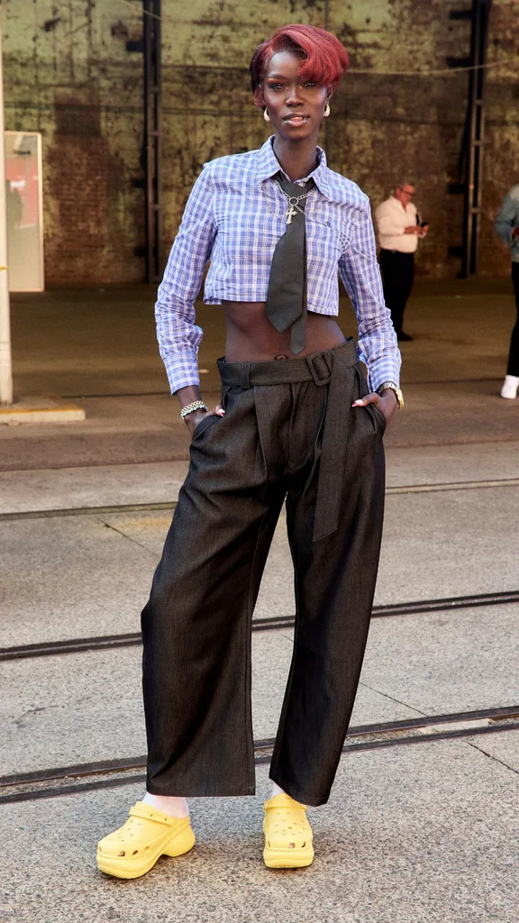
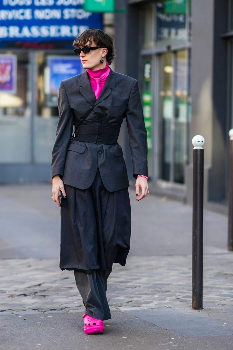
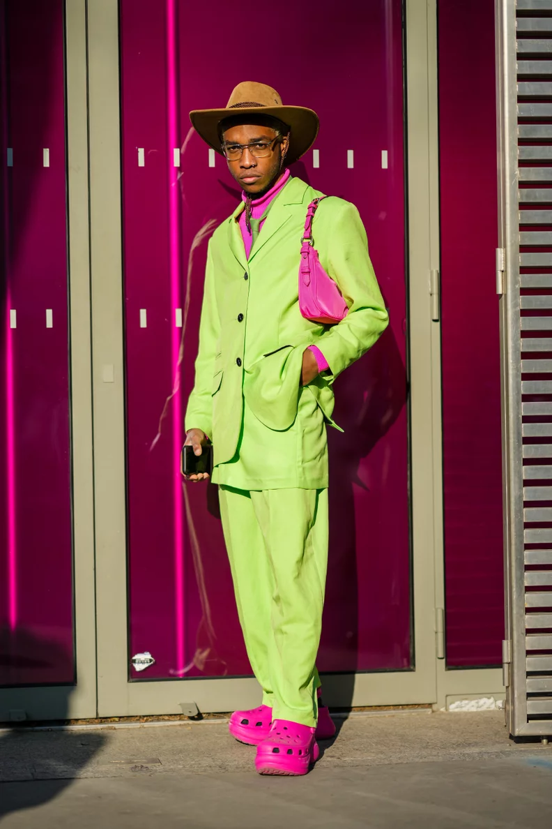
Reframing Crocs as expressive, ironic and customisable

They used collaboration as repositioning
Fashion and designer collabs
Pop culture and unexpected partnerships
Limited drops that created desire, not just utility

They rebuilt the campaign world
Bolder styling and unexpected contexts
Fashion, streetwear and music visuals
A clear visual language around personalisation (Jibbitz)
The logo stayed.The shoe stayed. The story changed.
After the rebrand: what actually changed
Crocs introduced a new brand strategy around 2017. By 2023, revenue hit about $3 billion, roughly three times the level before that relaunch.
Looking at the longer run: Crocs’ revenue was around $1.0B in 2017 and grew to roughly $4.1B by 2024 – about 4x growth in seven years.
From 2019 to 2021, revenue doubled, and net profit increased five-fold; the stock price rose about 16x from its 2020 low to its 2021 peak.
That growth isn’t only from branding (product, operations and the pandemic comfort-shoe boom helped too), but it shows that the shift from “ugly clog joke” to self-aware, collab-driven cult brand translated into real demand and pricing power, not just social media chatter.
Who they’re talking to now
Gen Z and young millennials
Fashion and streetwear audiences
People who want comfort and a statement
Same clogs. Entirely new context.
2. SKIMS: From Naming Controversy to “Solution wear” Brand

Before the rebrand
Kim Kardashian’s shapewear brand originally launched as “Kimono”.
The idea was strong:
Shapewear solving real wardrobe problems
Nude tones for multiple skin colours
A founder deeply involved in the product
But the name caused immediate backlash and overshadowed everything else.
The issue wasn’t the product. It was the brand wrapper.
What changed

The rebrand to SKIMS was decisive and strategic.
A new name with a clearer story
“SKIMS” suggests second skin and function
Clean break from cultural controversy

Clearer positioning
“Solution wear,” not just shapewear
Everyday basics, loungewear and underwear
A refined brand world
Neutral, skin-inspired palettes
Consistent imagery across site, socials and packaging
Inclusivity without over-explaining

Founder credibility
Kim visibly uses and explains the products
The brand feels built from lived experience, not celebrity endorsement
After the rebrand: what actually changed
SKIMS launched in 2019; by 2020 it was already doing about $145M in revenue. By 2023, analysts were estimating $750M–$1B – more than 5x growth in roughly three years.
One data provider pegs SKIMS at around $750M revenue in 2023 and a $4B valuation at that time.
In 2025, SKIMS raised a new round led by Goldman Sachs at a $5B valuation, with the company saying it was on track to exceed $1B in net sales in 2025. That valuation is now higher than the combined market caps of Victoria’s Secret and Under Armour.
Again, that’s product + operations + Kardashian machine, not just a new name. But the pivot from Kimono to SKIMS with a clearer “solutionwear” story gave the brand a platform that investors, press and customers could actually get behind – and scale.

Who they’re talking to now
People who want basics that actually work
Shoppers who care about fit, tone range and comfort
Customers who trust founder-led problem solving
This is a rebrand driven by clarity, not just damage control.
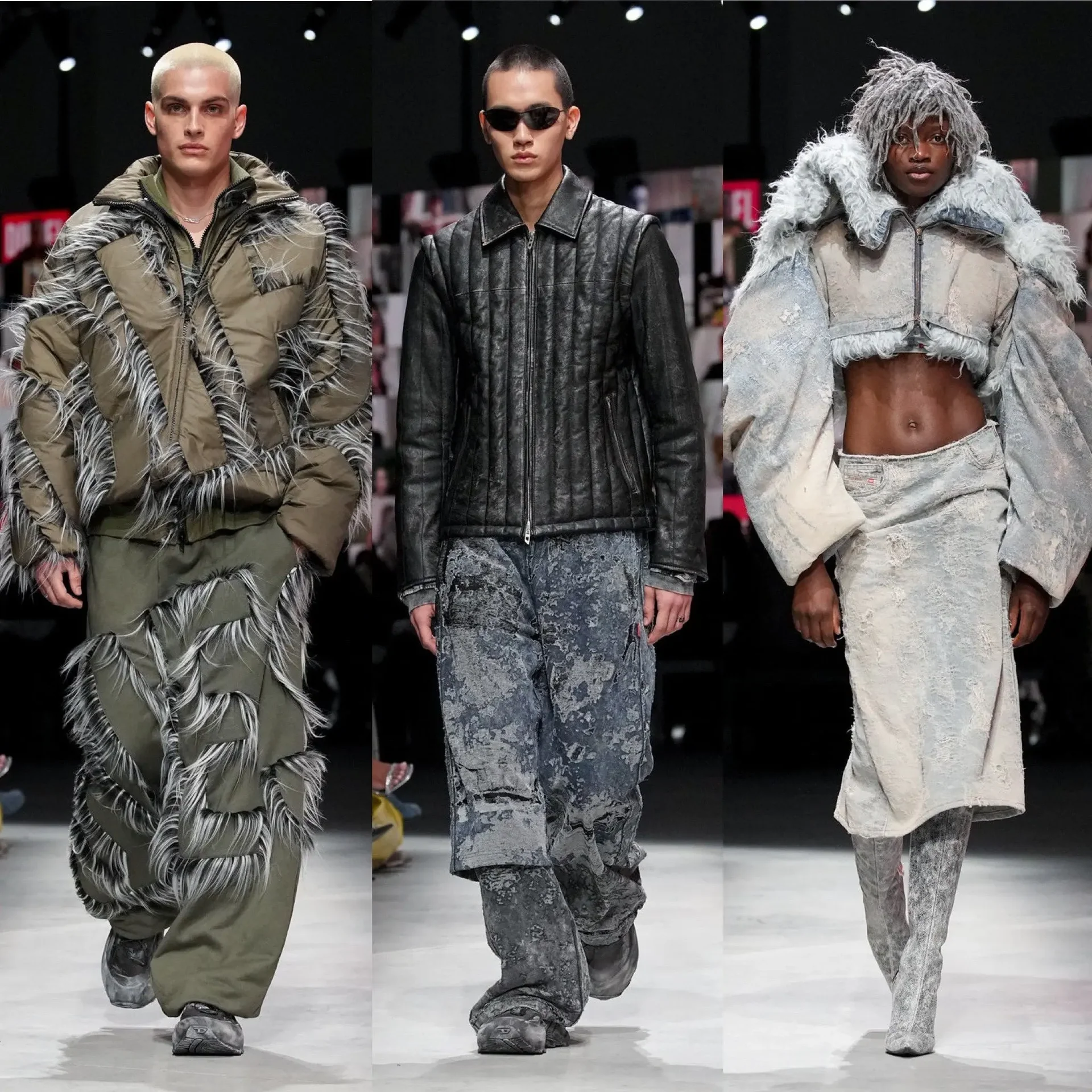
3. Diesel: A New Creative Era, and Becoming Relevant Again
Before the rebrand

Diesel was iconic in the 90s and early 2000s but also controversy. Over time, it started to feel:
Less present in fashion conversations
Overshadowed by newer luxury and streetwear brands
Anchored to an outdated idea of rebellion
The brand history was strong.The relevance wasn’t.
What changed
A new creative direction marked a clear rebrand-by-era.
Creative leadership shift
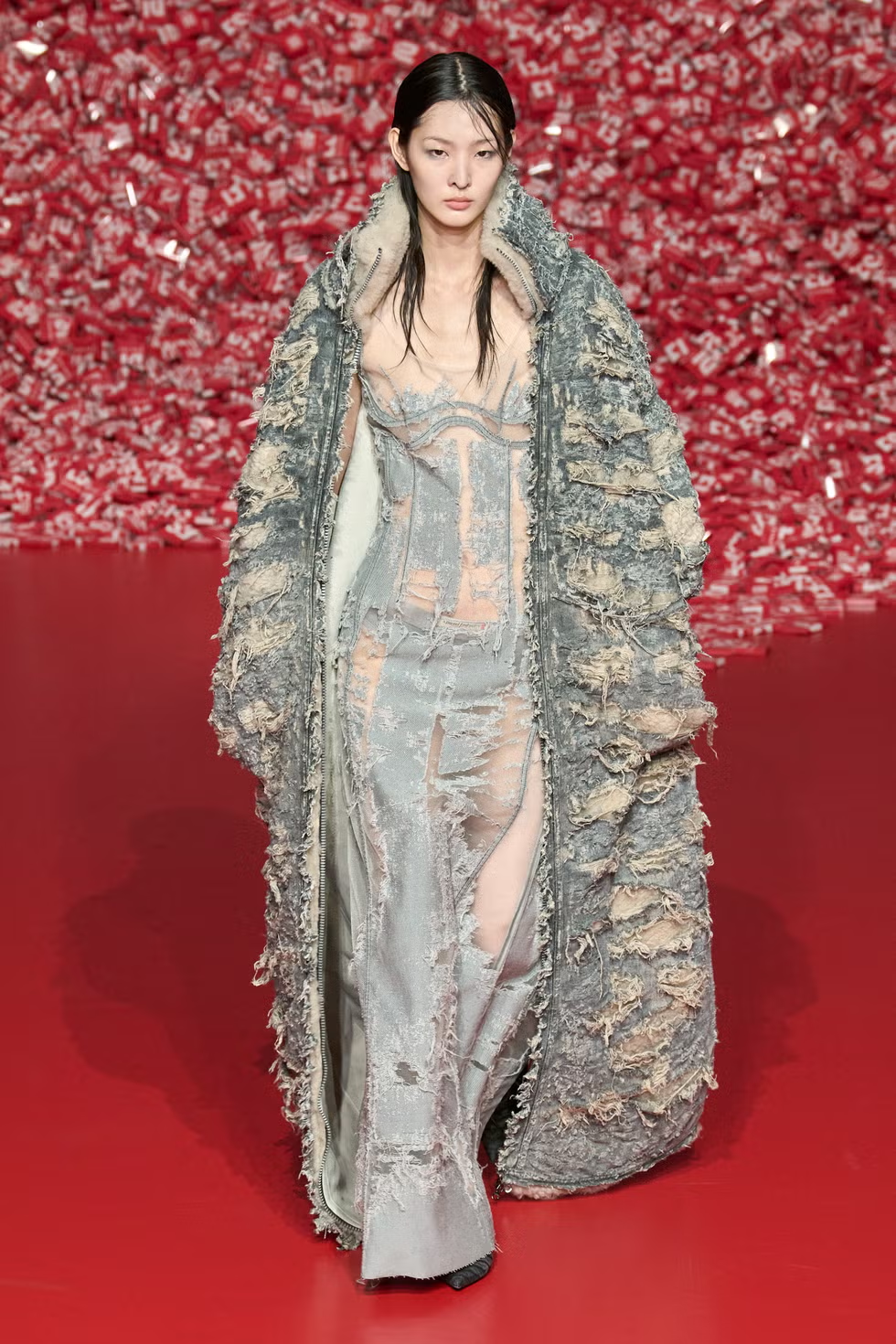
Concept-driven runway shows
Campaigns that felt bold, strange and current
Denim treated as experimental and high-fashion
Updated visual language
Editorial, high-energy imagery
A modern take on sexiness and youth culture
Product repositioning
Reimagined denim cuts and treatments
Accessories and ready-to-wear designed for visibility
Renewed presence in fashion media and influencer culture
The name stayed. The era changed.
After the rebrand: what actually changed
Under creative director Glenn Martens (appointed in 2020), Diesel has been explicitly repositioned as an “alternative luxury” player, with sustainable denim and a bigger push on accessories and fragrance.
The brand has staged what press are openly calling a comeback: Diesel’s high-impact Milan shows and provocative denim (ultra-low rises, experimental cuts) have reinserted it into the fashion conversation.
Crucially, the rebrand has landed with younger customers: Gen Z (16–25) now accounts for about 36% of Diesel’s sales, according to recent coverage – a big deal for a label that had been seen as “your older cousin’s denim brand” a few years prior.
It’s hard to find clean public revenue splits for Diesel alone, but industry reporting is consistent: the Martens era has shifted Diesel from fading mass-market denim to a brand Gen Z actually cares about again.
What These Rebrand Examples Have in Common
Across Crocs, SKIMS and Diesel:
The old brand no longer fit
Crocs: stuck as a joke
SKIMS: wrong name and narrative
Diesel: outdated relevance
They changed more than visuals
Positioning, story and meaning
Creative direction and culture
Who the brand is really for
They redefined perception
Utility → cult
Controversy → credibility
Nostalgia → relevance
A true rebrand is a strategic reset — not a cosmetic one.
When You’re in Rebrand Territory (Not Just Refresh)
You’re likely ready for a rebrand if:
Your audience, market or region has changed
Your pricing and quality have grown, but the brand hasn’t
Your name or story is holding you back
People consistently misunderstand what you do
Your internal reality no longer matches what the outside world sees
That’s when tweaks aren’t enough.
You need to rethink:
Positioning
Story and language
Identity and creative direction
Website, content and campaign rollout
Where We Come In
At The Stylatude, we work with brands who are:
Too established for DIY branding
Too evolved for their current name, look or story
Ready to step into a new phase of growth
Our Brand Glow-Up / Rebrand work helps you decide whether you need:
A strategic refresh, or
A true rebrand like the examples above
Then we build:
Brand strategy and positioning
Visual identity and creative direction
Website experience and launch-ready content
So the brand people see finally matches the brand you’ve become.







Comments